All-Star 2012-2013 New Uniforms

Welcome to our Cheerleading Community

Members see FEWER ads... join today!

Fierce Cheetahs :) I'm assuming the skirts haven't been posted yet?
tumblr_mknok7nBYd1r6rl8ko1_500.jpg
it suprises me but im in love with the white band underneath, the whole thing is gorgeous, I hope the shorts/skirt dont let it down
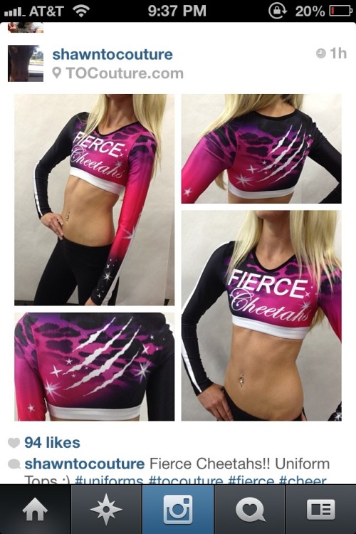
although im not sure about the font of the 'fierce'
Sent from my GT-I9300 using Tapatalk 2
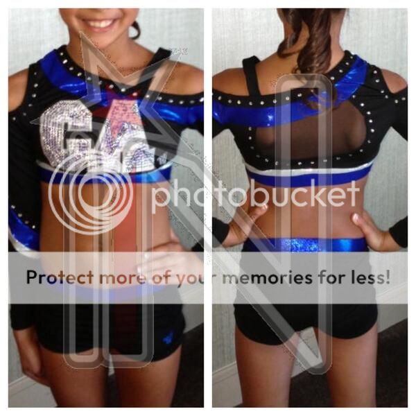
 
Fierce Cheetahs :) I'm assuming the skirts haven't been posted yet?

i love everything except for the font choices as well as the placement. the only good thing is that they chose to use a serif (if you can even say the cursive font is a serif) and sans serif instead of two sans serif together. i feel like for it to work better cheetahs could have gone on the side or the back and fierce moved down, it just feels so close to the neck line. i feel like even if the font was bolder and not italicized it would just be perfect.. this is kinda what i mean.. sorry for the bad photo shop :rolleyes:
288cakp.jpg
 
Not a very clear picture due to the girls hair covering most of the top!
Viper Cheer new uniform - their colours are red and black (looks like orange and black in this picture!). I only wish the "Vipers" on the top was slightly smaller and I would LOVE this uniform!
25u0ad5.jpg
I Don't know what I don't like about this. I just feel that the graphics are a bit hokey and cheesy looking.
 
While I coached in Germany, we were part of the CVD association which didn't allow Junior or Peewee (Juniors or Youth here) teams to have intentional crop tops (luckily it was only for 1 season, after that the club switched to CCVD which is a member of ICU/ECU) ... However, we wanted crop tops for our Juniors ;) so what we did is got everyone a skin-colored leo to wear underneath. It was basically a camisole looking thing but had the annoying buttons in the crotch to snap it closed.

194316_205771136100760_7409382_o.jpg

At any events or performances that weren't CVD affiliated, they could go without the annoying leo. ;)

this is actually the next option we are looking at, thanks for the pic, will help us see what it may look like.
 
this is actually the next option we are looking at, thanks for the pic, will help us see what it may look like.

No problem! It basically just looks like they all have no belly button! So it's kinda creepy, but looks more natural than a colored leo. :D We were also able to get different "shades" since we had a few darker skinned girls.

It's also a nicer way for girls to cover up who don't feel 100% comfortable with a crop top. And if it continues with the cover up and crop top rules, it would be a way to get around it (without having to get full tops if you didn't 100% want one).
 
Saw the worst uniform I've ever seen today at competition. Maybe two actually. First, if your team colors are pink and teal, I implore you to not make the ENTIRE uniform a matte pink with teal accents. It was overwhelmingly... Pink. Like peptic bismol pink. One of the people I was sitting with, halfway through their routine, says "I just can't take this team seriously."

Agreed.

And might I also suggest that black mystic from a distance...under lights... When it's the sole fabric for boys pants... Looks like 1) trash bags 2) hotpants and/or 3) leather pants.

No. No. And no.

I've posted no pictures to protect the innocent. Smh.


The Fierce Board App! || iPhone || Android
 
mafia_zps244525b9.jpg

Mafia got new uniforms again...? Confused, also Cali is usually pretty good about cutouts and mesh and such but these seem random to me...
ETA: This is what UltimateAlexis posted a link to
Overall, I like them. but, the mesh cutout in the back seems a little random. And I don't like the way the "A" on the front goes into the blue. I'm not sure if the "A" looks bigger because of that, or if it really is bigger than the "C".
 
Overall, I like them. but, the mesh cutout in the back seems a little random. And I don't like the way the "A" on the front goes into the blue. I'm not sure if the "A" looks bigger because of that, or if it really is bigger than the "C".
it looks bigger to me too! I feel like the CA is just too big to begin with, I wish it was a little smaller. Especially compared to the other teams at the gym, their logo is usually smaller. And I miss the little star thing that goes behind it. I'm actually just really confused about why they got two new uniforms 2 months apart. Industry News tweeted their sublimated on February 6, and this one April 6... :confused:
 
mafia_zps244525b9.jpg

Mafia got new uniforms again...? Confused, also Cali is usually pretty good about cutouts and mesh and such but these seem random to me...
ETA: This is what UltimateAlexis posted a link to
I agree with everyone about the CA being too big. I think if the CA was smaller and the fabric part under and around the rhinestones was blue it would look better and it would pop more. I wish the shorts had a white strip like under the blue, so it matched the striping on the sleeve.
 
Instead of making new uniform again, I think mafia should still use their previous uniform and making some kind of adjusments and modifications on it. It is still better than their new one if we want to compare between previous uni and the new uni.

BCdS6EdCIAAJ0aY.jpg:large
 
Back