All-Star I Could Really Use Your Opinion...

Welcome to our Cheerleading Community

Members see FEWER ads... join today!

cRayCheerDad

Cheer Parent
Dec 15, 2014
96
257
Hey everyone,

I could really use some help. Quite a few folks outside of allstar cheerleading have stated that they would have never picked up the book to read it because of the cover. They did not understand the significance of the bow. The description was what brought them to the book.

That is flattering, but scary as the cover of a book can be huge.

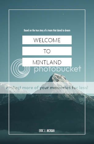
Many have suggested to change the cover to show the team on the front cover of the book instead of the bow. Many do not know what "Summit" is, or the significance of the Summit bow on the front cover currently.

It is coming up on the two year anniversary so I was thinking it could be a good time to change the cover, but I really value your opinion on this since this is the community I wrote the book for (along with the team).

Here is what I could use your opinion on. Should I?

1. Keep the same.
2. Use option 1
3. Use Option 2

Thanks for taking the time read this. Any feedback would be greatly appreciated :)

Original Cover

screen.png

Option 1
screen.png


Option 2


screen.jpg
 
Last edited:
Use option 1. Most people will not recognize a cheer bow (original) or the Summit symbol (original and option 2) . Do not limit potential buyers seeking a "fresh" story by posting the years in the upper right corner of option 2. Option 1 has a lovely photo, the font is appealing, and the teaser "The Improbable Story of a Team that Dared to Dream" will appeal to readers looking for a "feel good" story.
 
Option 1. I like Option 2 as well but personally the tagline on Option 1 would draw me in more.

Even as an (albeit young in knowledge) insider, I don't know the significance of the bow on the original?
 
Hi, I am not new to cheer but I don't know the story or the book. The first cover would not pull me in. I prefer the second, which clues me in that this is a cheerleader story but also the subtitle is telling me it might be good for anyone interested in a story about teamwork.
 
Option 1 is more eye catching and although I absolutely know who the Stingrays are as a gym I have no idea about the significance of the bow :(
 
Is your target audience cheer people or non-cheer people?

The covers, to me, seem more like "blog post images" or "pinterest pin covers" rather than book covers. Personally, I love the "less is more" approach to design and I find simple designs more eye-catching. I think this is particularly important for book covers. Like you said, a well designed book cover will make or break a book, so it's incredibly important to get it right. You aren't trying to tell the entire story through the cover, you really only need to catch people's attention while relating it back to the story - and you don't need to have a literal relation. If your target auidence isn't cheer people, you could use something that's more representative of a part of the story like a peppermint or a map or a mountain or cheer shoes or something. Even if it is cheer people, you could still use an "abstract" image. Chances are, cheer people will read it solely because it's about cheer. (If you have 20 minutes to spare, Chip Kidd is a very well known book cover artist, he came up with the famous Jurassic Park book cover. He did a TED talk on book covers a few years back and explains cover design really well if you want to listen here. I'm not a huge fan of all of his work and he's a little Seussical at times but he knows what he's talking about.)

With that being said, from the options you have now, I think Option 1 would be the best.

If you want to improve it and make it a stronger design, here are my suggestions:
- Not sure what kind of software you have access too, but I would sihlouette the bow and put it on a solid color background. Use a drop shadow if it looks good. It seems like you're trying to make it the focal point but there's too much going on in the design for it to be the focal point.
- I would keep the title together instead of splitting it and having it on the top and bottom like it is now. Split between one, two or three lines of text is fine as long as you don't split the text up from the other line(s).
- I would use a font that's easier to read for the title. San serif fonts are very trendy right now and they look really nice, expecially for book covers. Also, if this was a romance novel of some sort, then I'd say the script font is fine but I think using a more "sturdy" font will coincide with the story of the uphill climb you talk about in your book.
- Remove the "fluff" stuff - the banner around the name and the Summit symbol. They distract from the focal point and don't really enhance the design that much - they weigh it down and confuse the eye a bit. The banner takes attention away from the rest of the text and the author's name should be very, very low on the "hierarchy of information" in a book cover design. When you put the banner around it, you highlight it and draw attention away from the other things, thus moving it further up in the hierarchy. (Heirarchy of information/visual hierarchy is what the brain reads first when presented with information. I would say the hierarchy for this cover should be imagery/title>subtitle>authors name.) The Summit icon goes back to "you arent trying to tell the whole story through the title".
- As a rule of thumb, you should use two or less types of fonts for simple designs like this. This one has 4 which really mess with the heirarchy. If you use two, make sure they are contrasting fonts (sans serif/serif and heavy font/light font are common font pairings)
- The use of only two colors is good. Definitely makes it stronger than the other two options.

Google searching for "best book covers" or something similar will show you some examples that follow a lot of the things I mentioned and might help you find a layout/inspiration that will work better for you and your book :)
 
Last edited:
My only question is about consent/photo releases. I know your kiddo was on the team and you probably know all of the parents well, but I'd definitely have them all sign off on the use of the photo if you haven't already. In this day and age I don't know that I'd want my kid on the cover, no matter where it was being sold, but plenty of parents are cool with sharing.

Other than that, @Eyes On The Prize knows what she's talking about. I'd take her advice :)
 
Is your target audience cheer people or non-cheer people?

The covers, to me, seem more like "blog post images" or "pinterest pin covers" rather than book covers. Personally, I love the "less is more" approach to design and I find simple designs more eye-catching. I think this is particularly important for book covers. Like you said, a well designed book cover will make or break a book, so it's incredibly important to get it right. You aren't trying to tell the entire story through the cover, you really only need to catch people's attention while relating it back to the story - and you don't need to have a literal relation. If your target auidence isn't cheer people, you could use something that's more representative of a part of the story like a peppermint or a map or a mountain or cheer shoes or something. Even if it is cheer people, you could still use an "abstract" image. Chances are, cheer people will read it solely because it's about cheer. (If you have 20 minutes to spare, Chip Kidd is a very well known book cover artist, he came up with the famous Jurassic Park book cover. He did a TED talk on book covers a few years back and explains cover design really well if you want to listen here. I'm not a huge fan of all of his work and he's a little Seussical at times but he knows what he's talking about.)

With that being said, from the options you have now, I think Option 1 would be the best.

If you want to improve it and make it a stronger design, here are my suggestions:
- Not sure what kind of software you have access too, but I would sihlouette the bow and put it on a solid color background. Use a drop shadow if it looks good. It seems like you're trying to make it the focal point but there's too much going on in the design for it to be the focal point.
- I would keep the title together instead of splitting it and having it on the top and bottom like it is now. Split between one, two or three lines of text is fine as long as you don't split the text up from the other line(s).
- I would use a font that's easier to read for the title. San serif fonts are very trendy right now and they look really nice, expecially for book covers. Also, if this was a romance novel of some sort, then I'd say the script font is fine but I think using a more "sturdy" font will coincide with the story of the uphill climb you talk about in your book.
- Remove the "fluff" stuff - the banner around the name and the Summit symbol. They distract from the focal point and don't really enhance the design that much - they weigh it down and confuse the eye a bit. The banner takes attention away from the rest of the text and the author's name should be very, very low on the "hierarchy of information" in a book cover design. When you put the banner around it, you highlight it and draw attention away from the other things, thus moving it further up in the hierarchy. (Heirarchy of information/visual hierarchy is what the brain reads first when presented with information. I would say the hierarchy for this cover should be imagery/title>subtitle>authors name.) The Summit icon goes back to "you arent trying to tell the whole story through the title".
- As a rule of thumb, you should use two or less types of fonts for simple designs like this. This one has 4 which really mess with the heirarchy. If you use two, make sure they are contrasting fonts (sans serif/serif and heavy font/light font are common font pairings)
- The use of only two colors is good. Definitely makes it stronger than the other two options.

Google searching for "best book covers" or something similar will show you some examples that follow a lot of the things I mentioned and might help you find a layout/inspiration that will work better for you and your book :)

THIS! This is so well written.
I would take all of this advice. Play around with font weights and don't look for etsy trends as inspiration. Don't settle for cut and paste.
 
Is your target audience cheer people or non-cheer people?

The covers, to me, seem more like "blog post images" or "pinterest pin covers" rather than book covers. Personally, I love the "less is more" approach to design and I find simple designs more eye-catching. I think this is particularly important for book covers. Like you said, a well designed book cover will make or break a book, so it's incredibly important to get it right. You aren't trying to tell the entire story through the cover, you really only need to catch people's attention while relating it back to the story - and you don't need to have a literal relation. If your target auidence isn't cheer people, you could use something that's more representative of a part of the story like a peppermint or a map or a mountain or cheer shoes or something. Even if it is cheer people, you could still use an "abstract" image. Chances are, cheer people will read it solely because it's about cheer. (If you have 20 minutes to spare, Chip Kidd is a very well known book cover artist, he came up with the famous Jurassic Park book cover. He did a TED talk on book covers a few years back and explains cover design really well if you want to listen here. I'm not a huge fan of all of his work and he's a little Seussical at times but he knows what he's talking about.)

With that being said, from the options you have now, I think Option 1 would be the best.

If you want to improve it and make it a stronger design, here are my suggestions:
- Not sure what kind of software you have access too, but I would sihlouette the bow and put it on a solid color background. Use a drop shadow if it looks good. It seems like you're trying to make it the focal point but there's too much going on in the design for it to be the focal point.
- I would keep the title together instead of splitting it and having it on the top and bottom like it is now. Split between one, two or three lines of text is fine as long as you don't split the text up from the other line(s).
- I would use a font that's easier to read for the title. San serif fonts are very trendy right now and they look really nice, expecially for book covers. Also, if this was a romance novel of some sort, then I'd say the script font is fine but I think using a more "sturdy" font will coincide with the story of the uphill climb you talk about in your book.
- Remove the "fluff" stuff - the banner around the name and the Summit symbol. They distract from the focal point and don't really enhance the design that much - they weigh it down and confuse the eye a bit. The banner takes attention away from the rest of the text and the author's name should be very, very low on the "hierarchy of information" in a book cover design. When you put the banner around it, you highlight it and draw attention away from the other things, thus moving it further up in the hierarchy. (Heirarchy of information/visual hierarchy is what the brain reads first when presented with information. I would say the hierarchy for this cover should be imagery/title>subtitle>authors name.) The Summit icon goes back to "you arent trying to tell the whole story through the title".
- As a rule of thumb, you should use two or less types of fonts for simple designs like this. This one has 4 which really mess with the heirarchy. If you use two, make sure they are contrasting fonts (sans serif/serif and heavy font/light font are common font pairings)
- The use of only two colors is good. Definitely makes it stronger than the other two options.

Google searching for "best book covers" or something similar will show you some examples that follow a lot of the things I mentioned and might help you find a layout/inspiration that will work better for you and your book :)
Thank you for the amazing feedback. In answer to a couple of your questions.
1. Initially the book was written just for the team. ( Spoiler alert, I was the team dad) Since uploading it to Amazon, it has been picked up by Barnes and Noble, Books a Million, Itunes Bookstore Kindle etc.. it has been purchased all over the world. So I guess the audience has changed a bit since being initially written and created for the team. Hence the need for a potential redesign.

2. With respect to your comment about the logo being a "blog post image" or "pinterest pin cover", That is because you may have seen it as such. The blog is actually more popular than the book at this point and is also named "Welcome to Mintland". If I change the cover dramatically I would also want it to match the blog and the podcast logo's as well.

The two other options created were quick concepts pieced together that would need to be polished. I love your feedback and will probably look to have someone spend more time on it to give it a more polished feel.

Thank you again!
 
My only question is about consent/photo releases. I know your kiddo was on the team and you probably know all of the parents well, but I'd definitely have them all sign off on the use of the photo if you haven't already. In this day and age I don't know that I'd want my kid on the cover, no matter where it was being sold, but plenty of parents are cool with sharing.

Other than that, @Eyes On The Prize knows what she's talking about. I'd take her advice :)
Great point. We have permission from the photog on the photo. Yes, I know all the parents very well as I was team dad for the team that year. I wrote the book for the team as I was so inspired by them. :)
 
Thank you for the amazing feedback. In answer to a couple of your questions.
1. Initially the book was written just for the team. ( Spoiler alert, I was the team dad) Since uploading it to Amazon, it has been picked up by Barnes and Noble, Books a Million, Itunes Bookstore Kindle etc.. it has been purchased all over the world. So I guess the audience has changed a bit since being initially written and created for the team. Hence the need for a potential redesign.

2. With respect to your comment about the logo being a "blog post image" or "pinterest pin cover", That is because you may have seen it as such. The blog is actually more popular than the book at this point and is also named "Welcome to Mintland". If I change the cover dramatically I would also want it to match the blog and the podcast logo's as well.

The two other options created were quick concepts pieced together that would need to be polished. I love your feedback and will probably look to have someone spend more time on it to give it a more polished feel.

Thank you again!

Ahhhh now I understand, gotta keep that branding consistent :p

In that case, I think you could do something really nice and eye catching using a layout that's more typography based and an element in your logo - maybe using the mountain instead of the bow as the focal image? You don't even have to use an image really, you can just have a two-color design. There's a million ways to make something like that look really good and more book-like (yet still tie in with your blog and podcast's branding).

But if you're not in the market to redesign the entire thing and just looking to improve your current options, I would still make sure to focus on the visual hierarchy. Maybe bring the "Welcome to" and "Mintland" together, pick two fonts for the text, make sure the subtitle is higher up in the hierarchy, etc.
I'm not afraid of a complete re-brand but would like to keep some elements of the look and feel from the team.

Summit is only one aspect of the story. The bigger part of the story is the team culture, the relationship with the Peach Rays and a coach that believed with all her soul that this team could go this far and they dared to believe it.

Although the book is about a mini team, the audience obviously was "Young Adult". I want to keep the AS cheer culture on the cover but have found more and more that adults have been buying it. The younger readers and cheer parents have gravitated to the podcast, I am guessing because they are always running to and from school to cheer practice and don't have much time to sit down and read a book. (Which I can certainly relate to)

To get a feel and vibe from all components of the pictures, book trailer, podcast, blog, etc.. you can take a quick look here welcometomintland.strikingly.com your feedback has been invaluable!
 
Last edited:

Latest posts

Back