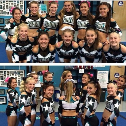
Models white uni is so cute probably my favorite uni out as of now. at the accent of their gyms colors on the arms to tie their gym in together is very cute!
Cropped sleeves are commen for competition Leo's, and actually quite comfortable, as they aren't to long and they look uniform instead of being long on one girl and short on another
Cropped sleeves are commen for competition Leo's, and actually quite comfortable, as they aren't to long and they look uniform instead of being long on one girl and short on another
Oh yeah, I've seen it on leos before! I was thinking more of cheer, I haven't seen it before but overall like it! It gives more of an athletic feel in my opinion.
I was never a fan of a PSS uniform because I always thought the colors clashed too much (not hating on the program, been a supermodels fan since they were large senior) But that white uniform... My heart is so filled with joy. It's absolutely gorgeous. I might even have a tear in my eye.
The P isn't from the state of PA. It's a take off of Fierce brand, with the big F.
My daughter used to be a superstar. I love them both. Although I think I was very much in the minority in that I didn't like the last ones at all. I still have the original uniform. It was very blue. lol
The P isn't from the state of PA. It's a take off of Fierce brand, with the big F.
My daughter used to be a superstar. I love them both. Although I think I was very much in the minority in that I didn't like the last ones at all. I still have the original uniform. It was very blue. lol
I feel like if the silver accents and the Crystal rhinestones were a gold color the Models uniform would look more cohesive with the program uniform. It would also be absolutely beautiful if the uniform were black with the gold accents in my opinion. I do love the red and blue stone fill accents though. Overall they are both very well done.


")