the design of COBRAS' font is awful, in my opinion. If i try to look that uniform from far far place, it will be looked as COBBBS i think they could use another different font style.
Hard for us Seminole fans not to automatically think Go Gators!!, that's all I see, but I bet the sleeves are gorgeous in person and the pic above of the varsity design catalog is very pretty. Nice design. I'm sure the picture isn't doing them justice. I like the guys and girls both, just garnet and gold would look fab. . .
No, Miami fans, don't start green and orange - no.
Is the backing on the boys Cobras orange and the girls blue? Why not the same- and shouldnt the boys have the same blue square in the center? just seems off if not the same -
they realized they were not going to have enough orange trim for all the uniforms so they found out if they just withhold 1.5 inches off every uni then everyone can have a little orange and still look the same
I like the design! And all the rhinestones! I wish there wasn't so much mystic though. Or if the black or the white was switched with the purple.... Then you could still have mystic purple. I just like uniforms with a neural color as the main color, so that's why. I think it will look good on the floor! Very shiny
I like the design! And all the rhinestones! I wish there wasn't so much mystic though. Or if the black or the white was switched with the purple.... Then you could still have mystic purple. I just like uniforms with a neural color as the main color, so that's why. I think it will look good on the floor! Very shiny
Thank you! I wish the black and purple was switched also, but the purple is our main color so I doubt my coach would even think about it lol. We have a comp tomorrow so Ill make sure to get pictures of them on the floor!

 i think they could use another different font style.


 It's not that I dislike it, I just like last year's better!
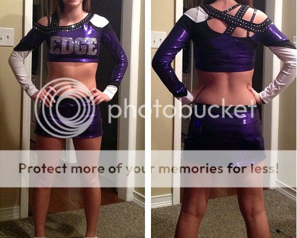
") I wish the black and purple was switched also, but the purple is our main color so I doubt my coach would even think about it lol. We have a comp tomorrow so Ill make sure to get pictures of them on the floor!
I wish the black and purple was switched also, but the purple is our main color so I doubt my coach would even think about it lol. We have a comp tomorrow so Ill make sure to get pictures of them on the floor!