Hawks uni is super gorgeous... athletic, flattering, and pretty... all great things for a uniform! I'm not loving the top of the back (it's definitely unique, just not my style)... with a stand out uni like that I just find it unnecessary.
Hawks uni is super gorgeous... athletic, flattering, and pretty... all great things for a uniform! I'm not loving the top of the back (it's definitely unique, just not my style)... with a stand out uni like that I just find it unnecessary.
Thanks! And I agree, not one person on the team really has a bra that works well with it... It's school cheer so they couldn't really have us all purchase a specially made bra.
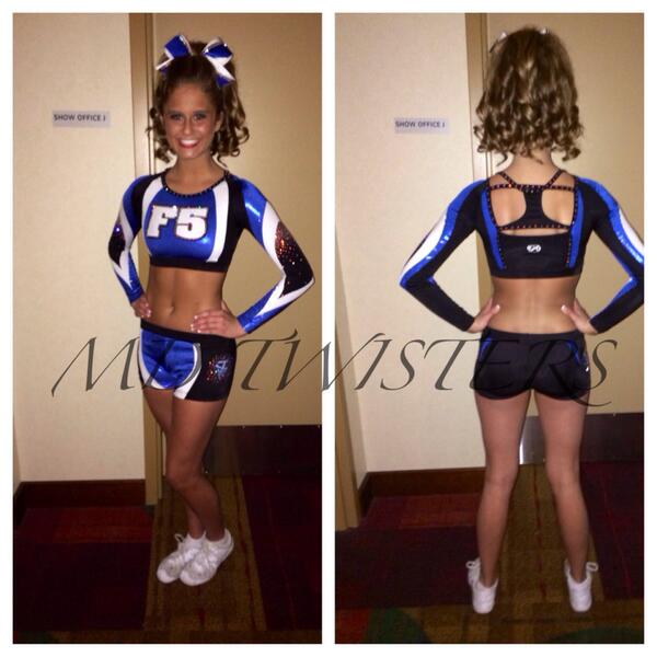
I saw the Tri Athletics uniform at SOH this weekend, and seeing it in the lobby...I thought it was the worst usage of mesh if ever seen. Seeing it on stage now on the other hand...it looked absolutely beautiful. The only stomach mesh I've seen look that good was the F5 uniform.
I also saw the new Charlotte Extreme ones and I love love love how they kept the skyline like they were know for in their old unis, but made it completely rhinestones. When someone turned on the stage it did nothing but sparkle! Soooo gorgeous! Well done CE
I guess I'm biased because this top is very similar to mine, but I just can't seem to like it. The neckline should be black, and the strap should be black. There isn't a barrier to break the colors up. And the font just seems like it needs a backing to highlight the stones, because they're kind of hard to read. And it needs to be pushed up right to the bottom swoosh of red (if that makes sense.)
Our uniform says our three Initials, and the "S" (middle letter) lines up right on the bottom of the red, which I feel is what is supposed to happen with this top.
But you know what? Well done because I don't see a belly at all on this team. Kudos to y'all because we're season 2 with these and we've still got a few peeking bellies!
We competed at a competition they were at last year, and I couldnt stop looking at them..not in a good way. The shimmery light purple makes me think of a my little pony....and a pole dancer. JUST MY OPINION.
We competed at a competition they were at last year, and I couldnt stop looking at them..not in a good way. The shimmery light purple makes me think of a my little pony....and a pole dancer. JUST MY OPINION.
I saw them at WEM last March and couldn't even deal. They look so uncomfortable. The bigger chested girls....I felt so bad for them because that uniform has no support and no mechanism for a bra at all. Their program uniforms are not bad at all though, just the IO5 ones.
They don't even look like they're from the same program at all. I like them okay individually, but not together. Granted it's not really an issue since they won't be on the floor together but I feel like programs should have uniforms that go together better. Like even just having the same base color (navy or black) would help a lot. I get the silver/gold but idk why they couldn't accent blue with gold or black with silver.


")