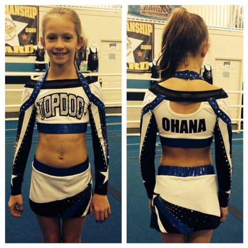
Is the sky uniform a catalog uni? It looks just like the uniform design I saw for a local team, but maybe I'm mixing them up. I know the back cutout a are the exact same though.
And just from pics, it doesn't seem like "big gyms" have a ton of elaborate practice wear, maybe an outfit, but the rest seems pretty moderate and just normal.
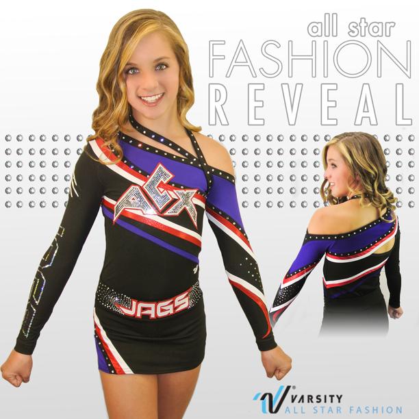
The only things I don't like about this uniform are the parts that are completely unnecessary, aka the random neck straps and back cutouts. Also never been a fan of the belt look. In my own little perfect world they would look something like this (obviously with better photoshop skills than my paint job) and they would be the uniforms sent from heaven lol
The only things I don't like about this uniform are the parts that are completely unnecessary, aka the random neck straps and back cutouts. Also never been a fan of the belt look. In my own little perfect world they would look something like this (obviously with better photoshop skills than my paint job) and they would be the uniforms sent from heaven lol
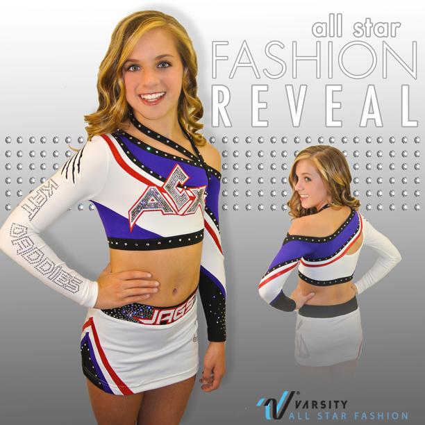
I actually like the belt (which is weird) because without it, it's more obvious that the angle of the lines on the top and the skirt are not the same. But I love the changes you made to the top!
I actually like the belt (which is weird) because without it, it's more obvious that the angle of the lines on the top and the skirt are not the same. But I love the changes you made to the top!
I'd be okay with it still being a belt I just don't like it when there are names or words on them. They remind me of those flashy belt buckles with the text that scrolls across it, where you awkwardly end up staring at someones crotch to read what it says. To me, "JAGS" being written across it is distracting, it brings all my attention to their lower stomach and away from their beautiful performing faces.
In an age where people are terrified of showing off their bodies because of perception, kudos to that girl who is like 'here are my abs for your sneak peek.' Go you.
I actually like the belt (which is weird) because without it, it's more obvious that the angle of the lines on the top and the skirt are not the same. But I love the changes you made to the top!
I agree. I dislike belts but I dislike full tops that look like the stomach material was an afterthought even more. That kind of makes it look like a crop someone just threw some black material on the bottom. I like the edited top!


")