All-Star New Uniforms 2014-2015 Season...just Because You Can, Doesn't Mean You Should!

Welcome to our Cheerleading Community

Members see FEWER ads... join today!

everythingcheermagazine posted a picture on Instagram of C4 longhorns new uniform (not sure if it's already been posted)
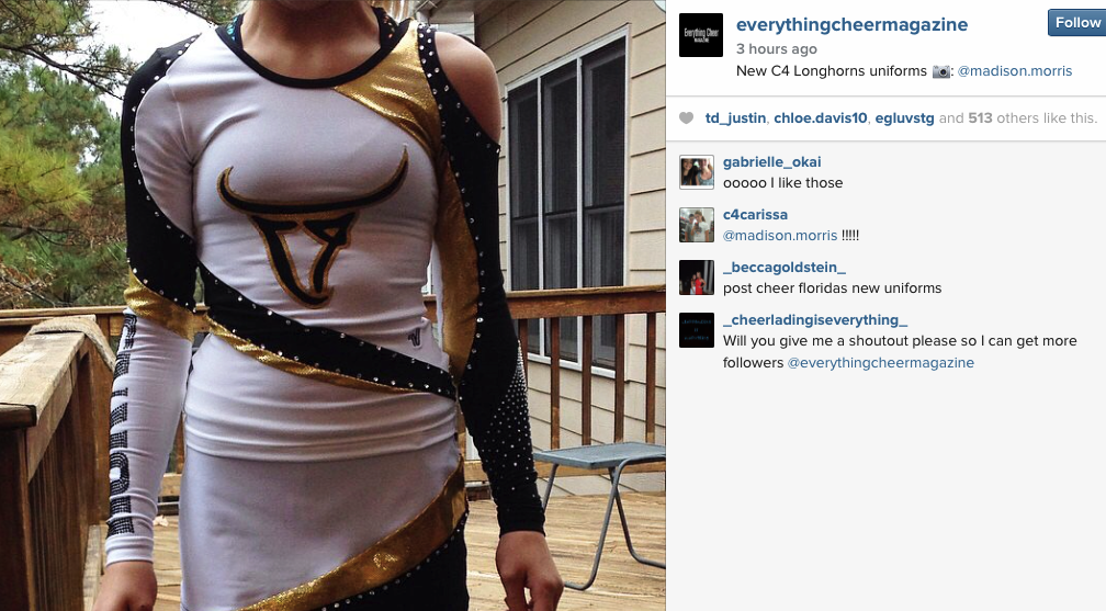
I do not think so, and here it is:
X4TO0wk.png
 
i like the idea behind the longhorns uniform, it was just executed poorly. connecting the stripe on the stomach with the arm is different and a nice way to break up and solid, plain stomach.

i agree with the logo being too low and it would look better if they changed the longhorn to letters vs the picture. the shape of the longhorn on a chest is like drawing a bracket around the boobs. it's odd. and unfortunately it just looks SO cheap. terrible construction and very poorly made which semi-confuses me since i see the sacred "V." but the white looks really, really thin, the gold is bunching up, and the stones look like they're already falling off.

i want to like it. i really do! the changes @cheerforeverever just made looks 2000% better! ugh.
 
I have to say in general I think 2015 uniforms are trending a tad more classic/athletic and for that I am grateful. I have not seen one cocktail waitress uniform, itty bitty polka dot bikini nor have I seen the mystique fabric uniform from hell. There have been some misses but in general much better than the past. But Oh Hey.....tomorrow is another day. :cheering:
 
I do not think so, and here it is:
X4TO0wk.png


I agree with everyone that the placement of the Longhorn is too low. It's a shame because I think that is a very well designed logo. I wonder if it wouldn't appear as low if it wasn't against stark white?

I am slowly realizing that mostly white uniforms never have the wow-factor me. The colors and design can be perfect, but since it shows everything..it's just distracting. :-/

no, i am a sucker for white uniforms!!!! but they have to be done correctly. Brandon World's teams, TG OO5 (the Omar/angel uniform.. not that corset thing they wore this season), Queensland Cheer Elite were stunning and were all white uniforms done right. I hope other gyms looking at white will look to them because they're stunning.

though i realize (this may sound harsh to some) it is possible they look so stunning because, for the most part, your worlds athlete are in tip top shape. if you put that uniform on the whole gym and every body type would it still look as good? idk. and that may be part of the "problem" of some white uniforms looking less than stellar. (you could have bigger kids on worlds teams and an entire S3 team with 6-pack abs, but overall I'd say worlds athletes are more conditioned and therefore in better shape. i hope no one finds that offensive?)
 
Back