All-Star 2012-2013 New Uniforms

Welcome to our Cheerleading Community

Members see FEWER ads... join today!

I love the Charlotte boys uni.. Fame is beautiful, I just hope the sparkle dosen't come off the arms from catching. Have they used this material before or tested it? CEA black unis are my fav. They have a mean but pretty look to them if that makes any sense. The rest of CEA are pretty as well. The only thing I dont like is the collar and thats just because my CP dosent like anything that "touches her" and would be clawing at it. It looks cool though and Im glad the girls had a part of making it their own! I am really excited to see them all up close in December!
 
I have seen this from both sides of the table now. I prefer the same uniform personally. However there is also a cost association with that must be considered. A lot of new parents may not want to spend a whole bunch of money for their first year cheerleader who will only wear it 6-8 times during the year, or for that athlete who is not committed to be a level 5 by age 10. You have to know the demographics of your market and cater to that, even if it does not make much "cheer" fashion sense to those outside of that market. :)

It's funny you should say this because our Jr teams are wearing the old level 5 uniform again this year and Lil Bit's is so worn out from the previous 3 years that we are borrowing 1 for this season. I counted and think that over the last 3 years she wore that uniform 170 times. That's an advantage of crossing over....getting your money's worth out of a uniform. (I do not want to have a crossover discussion. I'm just harassing tumbleyoda. I do that sometimes. ;))

That numbers high.....it's more along the lines of 144 times that uniform competed. LOL That is $1.67 per performance it cost me. I think that's pretty good! (And no wonder it's worn out.)
 
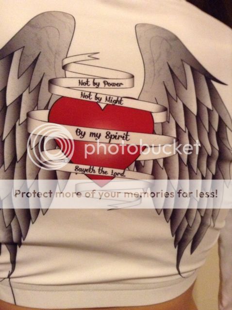
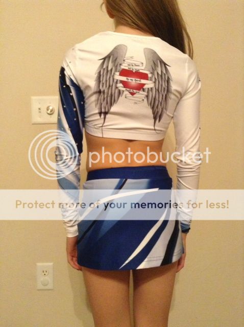
I guess I'm pretty lucky to be the one to say that my uniform from varsity fit me perfectly and I never had to alter a thing.. I think I like the T&S uniform a little bit more now that there's clearer pictures of everything. At first I thought that the blue started right at the beginning of the left sleeve and it looked off to me, but now I see that it doesn't. That was really my only problem with it. I love the bible verse on the back though, that's awesome.
 
Sorry for double posting.. but I took the five millionth look at the T&S uni and decided that the blue on the left sleeve still looks kind of weird since it just starts rather bluntly if that's the right word to describe it..
 
Sorry for double posting.. but I took the five millionth look at the T&S uni and decided that the blue on the left sleeve still looks kind of weird since it just starts rather bluntly if that's the right word to describe it..

Is it because it doesn't start at the seam that it looks weird to you? Cause I see what you're saying...I hadn't noticed that til you pointed it out though, lol
 
Yep, almost all white uniforms are all the rage here now, I guess. They have them, South Central Xtreme has them, and so does Findlay Cheer Elite. I just can't deal with the fact they all have white spankies.
Rock Solid from Pinellas Park?
 
I find it interesting that so many people love SSX's uni now.

When it came out, people on here were giving it the death stare...
I don't know about everybody else, but it's pretty common for me to dislike something so much initially and then warm up to it. I didn't like SSX's unis at first either, but I'm slowly starting to dig it.
 
Is it because it doesn't start at the seam that it looks weird to you? Cause I see what you're saying...I hadn't noticed that til you pointed it out though, lol
No.. hm, how can I explain this without sounding like a mess.. haha. I guess I would have preferred to see the blue start somewhere on the shoulder rather just start out of nowhere, even at the seam, it would be weird because then it would just look like some random sleeve. I'm so OCD about continuing lines..
 
No.. hm, how can I explain this without sounding like a mess.. haha. I guess I would have preferred to see the blue start somewhere on the shoulder rather just start out of nowhere, even at the seam, it would be weird because then it would just look like some random sleeve. I'm so OCD about continuing lines..

lol, I gotcha. I definitely see what you're saying. Not being a designer, I'm not sure how they could've made it blend unless they changed the design altogether.
 
It's funny you should say this because our Jr teams are wearing the old level 5 uniform again this year and Lil Bit's is so worn out from the previous 3 years that we are borrowing 1 for this season. I counted and think that over the last 3 years she wore that uniform 170 times. That's an advantage of crossing over....getting your money's worth out of a uniform. (I do not want to have a crossover discussion. I'm just harassing tumbleyoda. I do that sometimes. ;))

That numbers high.....it's more along the lines of 144 times that uniform competed. LOL That is $1.67 per performance it cost me. I think that's pretty good! (And no wonder it's worn out.)

Yes you do and you are one of the few members of the teal army that can get away with it with me. :D Reading the boards I have not seen the once a month crossover thread regarding CEA so I reckon it is time to start it up...lol. Just kidding and right back at you. :D
Currently our uniforms go on about a 3 year cycle. By that time it has usually been worn and resold enough. And since we are not a high profile program really the only one who cares what our uniforms look like is us. We are on our 2nd year for our senior teams uniforms, second year for the minis, and the youth, juniors and 4.2 all got new uniforms this year. Since we rarely use crossovers the life span is different. But then again we have a much different demographic that we are dealing with. It don't matter how cute a uniform is if the parents can't afford to pay for it.
 
T&S Jr. Heart (level 5)

HeartUniBack.jpg

Back

HeartUniCloseUpBack.jpg

Close Up of Back
(I left out the unneeded photos)
I really love these angel wings w/the heart in the middle but I think it would look better without the ribbon that has the saying on it. It's just hard to read from a distance.

I honestly love it and would kill just to be on that team! :)
 
Back