All-Star New Uniforms 2016-2017 Season

Welcome to our Cheerleading Community

Members see FEWER ads... join today!

6 Worlds teams, but maybe it's just the senior Worlds teams and the program one will be released later? Idk, but I'm really excited to see the rest of them!

I know there are 6 but I guess I assumed the international teams would keep old ones because college kids are poor... but I forgot it's been a while for rust, so I wouldn't be surprised if they had a new one, too, but debuted later.

Unless the four are prep, junior program, senior program, worlds? idk. I'm a little afraid to see them, but I hope the younger athletes keep the signature stingray look.
 
Agreed. They had such a classic, athletic look and I'm honestly upset that THAT is what they chose to go with. Why are there front cut outs? Why is the back open?
There's supposed to be a new prep team Uni this year too. I'm sure Rust will get one, it's been years for them.

Cs043zyWEAEu0OG.jpg

3 more to go, but now I am not looking forward to them. Also curious why there are 4... 4 worlds teams + program uniform should be 5. Or all worlds teams with the same uniform with a different name on the back makes 2. IDK. That, I am curious about.

Edited- My post didnt show up or something hmmmm. Anyway, there should be new prep team uniforms this year too. Maybe the plain blue arm, the other- possibly steel (though electric used that color mystique last year), white world's teams, blue bling arm- program Uni? Rust has to be getting new ones too, theirs are super old.
 
I love it! Still that clean cut Stingrays look but with a little edge.
 
It's just such a change from the clean athletic look we're used to from rays. Far from the worst uniform to be released but I almost feel like their look was what set them apart from other gyms. Especially with all of the prints going on, I'm not a fan:/

Sent from my SM-G930R4 using Tapatalk
 
i love a good white uniform, but peach uniform is a no for me. I dont hate it, but again with the stupid/pointless cutouts on the front.
 
It's just such a change from the clean athletic look we're used to from rays. Far from the worst uniform to be released but I almost feel like their look was what set them apart from other gyms. Especially with all of the prints going on, I'm not a fan:/

Sent from my SM-G930R4 using Tapatalk
15 year anniversary. I'm guessing this is the first of many new Rays 'ways' you will see this season.
 
I know that Peach, Orange, Steel and Apple are all getting different uniforms. Then there will be a gym wide uniform for Marietta. And then a different gym wide uniform for Johns Creek Rays. No word on the other worlds teams at Marietta but I assume they'll be different too.


Sent from my iPhone using Tapatalk
 
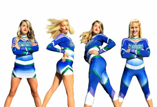
These are cute. There's quite a bit going on up top but the bottoms are simple enough to balance it out. The mesh panels on the pants are minimal and low enough that they don't bother me.
5eedaa8d21d752d27645c0060f46c9a0.jpg


Sent from my SM-G930R4 using Tapatalk

I like the one with the skirt but the capri's look like power rangers. That wide band is a no for me.

ETA: but they're not really bad. Just take out the green lines on the Capri's and it'd be less power rangerish.

eta2: I forgot you can't like on Tapatalk anymore

Sent from my iPhone using Tapatalk
 
Back