- Dec 14, 2009
- 5,675
- 16,692
I'm really digging the 24K uni. It's fitting to the "theme" - it looks like the equivalent of money if that makes sense? (I also like that they don't have those tiny jag paw prints everywhere.)
Yep yep yep. This is going to sound very designer-y but the white lines change the focal point of the uniform and it makes it weird. Your brain knows that the focal point SHOULD be the "LL" but because white has the most value contrast with black and the lines are very thick and strong in comparrison to to the other elements, which are fairly delicate and organic shapes (rather than the geometric lines), the eyes are drawn to the white and the lines become the new focal point. It also doesn't let the eye feel free to move around to look at the other parts of the uniform - its like locked into path of the white lines. If they changed the bottom white line to teal and made the other ones black so it looked like the top was apart of the rest of the uniform, it would be a lot better and the LL would stand out a lot more.
And that's what bugging me about it Apologies for the design critique lol
Just changing the white lines on the front and making them blue would already make it waaaayyy better.
Yep yep yep. This is going to sound very designer-y but the white lines change the focal point of the uniform and it makes it weird. Your brain knows that the focal point SHOULD be the "LL" but because white has the most value contrast with black and the lines are very thick and strong in comparrison to to the other elements, which are fairly delicate and organic shapes (rather than the geometric lines), the eyes are drawn to the white and the lines become the new focal point. It also doesn't let the eye feel free to move around to look at the other parts of the uniform - its like locked into path of the white lines. If they changed the bottom white line to teal and made the other ones black so it looked like the top was apart of the rest of the uniform, it would be a lot better and the LL would stand out a lot more.
And that's what bugging me about it
Apologies for the design critique lol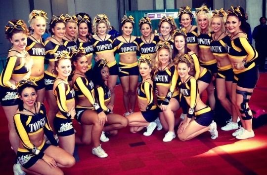
 :jawdrop: stingray allstars, who are you?!
 ️
️