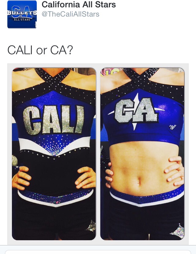
My daughter and I both voted for the Cali. (not that she was necessarily taking votes! lol) But then the CA is our logo and it's iconic. So now I'm torn. The good news is I'll be happy either way!
Okay these were my thoughts (in sequential order):
1. I personally don't like when I can see the elastic at the bottom of the crop top. Maybe a white stripe in lieu of an empty blue-ness that's gonna send my OCD out of control.
2. The sleeves are crazy! But in such a good way <3
Admittedly the sleeves are doing a lot. Way too much in fact... but I'm absolutely loving it. It's layered with a variety of colors and a tiny bit of mesh and it's so symmetrical. I know this is gonna highlight their motions on the mat.
Edit: Never mind, I see everyone noticed the empty crop top issue already ^_^
Cali's unis are beautiful thank god people can still design simple and gorgeous uniforms.
My vote is the CA logo one. The CA logo has a lot of breathing room in the design. The CALI one looks really cramped and doesn't fit in the space very well.

The parents love cost savings of using the thread less sequins.