Love MT cobalt, im undecided when it comes to odyssey. I like it but, the different sizing of the O's is going to drive me nuts all season. There are ways to make the O's similar sizes regardless of the differing in athletes heights, so i cant understand why a uniform company doesnt take the time to do so.
Not a fan of the O. It already says odyssey on the back, I don't think it needs any more. i would have preferred "World Cup" because with the O, it looks like there needs to be something on the sides.
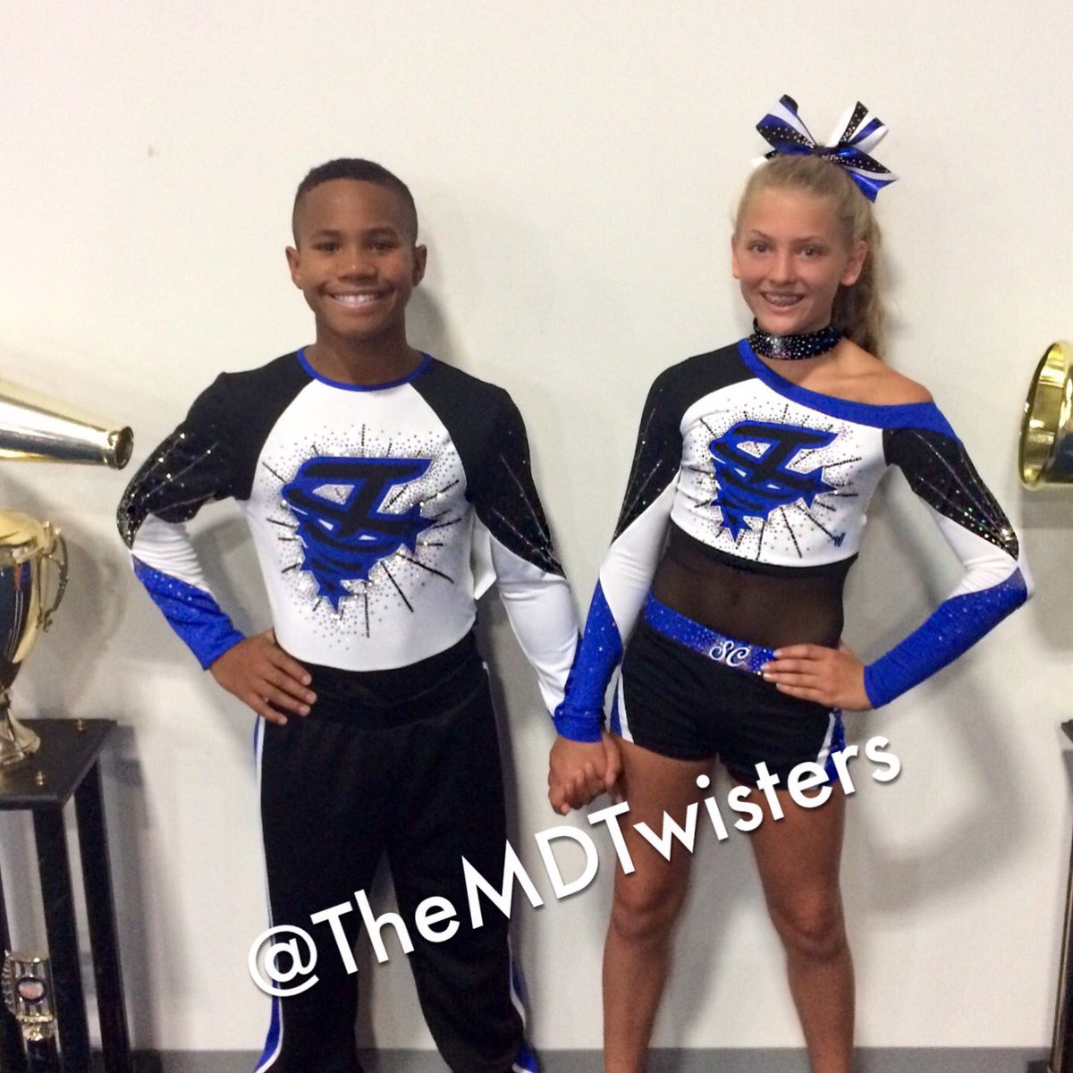
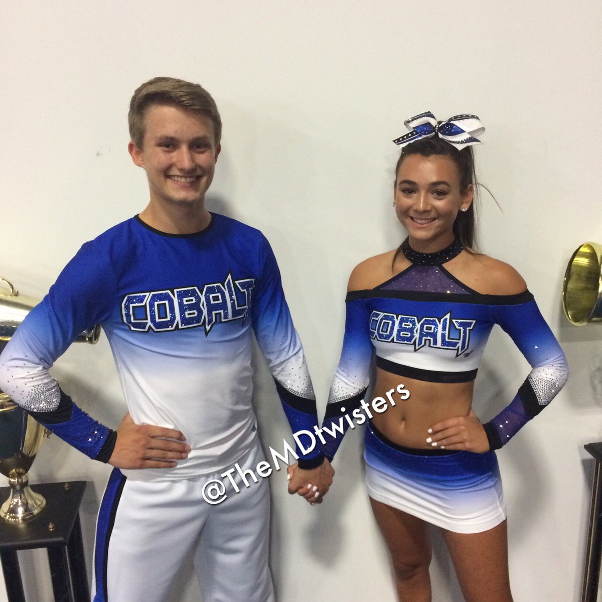
No to both of those MDT uniforms:/ super cells looks like an awkward adaption to a full top of an already awkward fitting crop. The sublimation is throwing me off on the Cobalt uniform and I've always hated that neckline.
Odyssey uniforms remind me of Suns (old?) uniforms, especially the top. I could do without the O on the shorts but it could also be much worse so I'm okay with the uniform overall.
Not a fan of the odyssey skirt but I really like the top! I just don't like the high slit with the O on the spanks... Or whatever is going on there. Also the two O's on the front is a little much, the one on the top is so big the one on the skirt is just overkill.
I didn't want to put my feedback on the pictures I posted so here we go:
Cells - I know the chokers are kind of their "thing" so it'd be fine if it were an all girl team. However, it's a pet peeve of mine on coed teams when the girls have asymmetrical necklines and the boys have a symmetrical, normal neckline top. It doesn't work together.
Cobalt - kind of the same thing with the necks, but because it's halter it doesn't bother me as much... and I just don't like that neckline at all. I like the rhinestoning on the arms.