All-Star New Uniforms 2016-2017 Season

Welcome to our Cheerleading Community

Members see FEWER ads... join today!

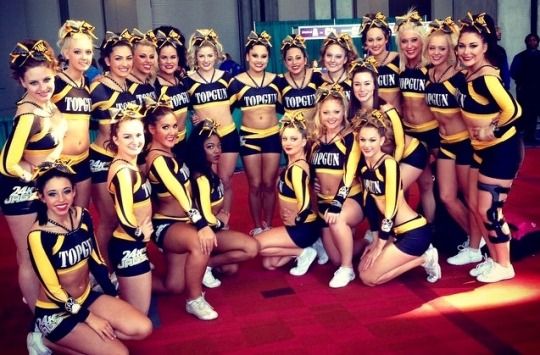
I'm really digging the 24K uni. It's fitting to the "theme" - it looks like the equivalent of money if that makes sense? (I also like that they don't have those tiny jag paw prints everywhere.)


Just changing the white lines on the front and making them blue would already make it waaaayyy better.

Yep yep yep. This is going to sound very designer-y but the white lines change the focal point of the uniform and it makes it weird. Your brain knows that the focal point SHOULD be the "LL" but because white has the most value contrast with black and the lines are very thick and strong in comparrison to to the other elements, which are fairly delicate and organic shapes (rather than the geometric lines), the eyes are drawn to the white and the lines become the new focal point. It also doesn't let the eye feel free to move around to look at the other parts of the uniform - its like locked into path of the white lines. If they changed the bottom white line to teal and made the other ones black so it looked like the top was apart of the rest of the uniform, it would be a lot better and the LL would stand out a lot more.

And that's what bugging me about it :p Apologies for the design critique lol
 
I'm really digging the 24K uni. It's fitting to the "theme" - it looks like the equivalent of money if that makes sense? (I also like that they don't have those tiny jag paw prints everywhere.)

No paw prints, because that isn't Top Gun 24K... unless Elite Heat uses paw prints, too, and I'm out of the loop? If so, disregard this message lol.


For reference, 24K with paw prints on sleeve:
22391743200ff921006d1e571356a7dd.jpg
 
No paw prints, because that isn't Top Gun 24K... unless Elite Heat uses paw prints, too, and I'm out of the loop? If so, disregard this message lol.


For reference, 24K with paw prints on sleeve:
22391743200ff921006d1e571356a7dd.jpg
I want TG 24K to be a team again because I loved those uniforms!
 
No paw prints, because that isn't Top Gun 24K... unless Elite Heat uses paw prints, too, and I'm out of the loop? If so, disregard this message lol.


For reference, 24K with paw prints on sleeve:
22391743200ff921006d1e571356a7dd.jpg

That makes a lot more sense! (I was really worried why there was no TG logo on it lol).

This is also the first time I've seen that TG 24K uni and I've concluded that I like the TG unis without the pawprint belt buckles.
 
I'm really digging the 24K uni. It's fitting to the "theme" - it looks like the equivalent of money if that makes sense? (I also like that they don't have those tiny jag paw prints everywhere.)


Yep yep yep. This is going to sound very designer-y but the white lines change the focal point of the uniform and it makes it weird. Your brain knows that the focal point SHOULD be the "LL" but because white has the most value contrast with black and the lines are very thick and strong in comparrison to to the other elements, which are fairly delicate and organic shapes (rather than the geometric lines), the eyes are drawn to the white and the lines become the new focal point. It also doesn't let the eye feel free to move around to look at the other parts of the uniform - its like locked into path of the white lines. If they changed the bottom white line to teal and made the other ones black so it looked like the top was apart of the rest of the uniform, it would be a lot better and the LL would stand out a lot more.

And that's what bugging me about it :p Apologies for the design critique lol
I agree with whatever you just said! :p
 
I guess this sport is truly going bra less, stingrays was my last string of hope.....being a big chested person.....why!!!!


Sent from my iPhone using Tapatalk

Agreed. They had such a classic, athletic look and I'm honestly upset that THAT is what they chose to go with. Why are there front cut outs? Why is the back open?


Cs043zyWEAEu0OG.jpg

3 more to go, but now I am not looking forward to them. Also curious why there are 4... 4 worlds teams + program uniform should be 5. Or all worlds teams with the same uniform with a different name on the back makes 2. IDK. That, I am curious about.
6 Worlds teams, but maybe it's just the senior Worlds teams and the program one will be released later? Idk, but I'm really excited to see the rest of them!
 
Back