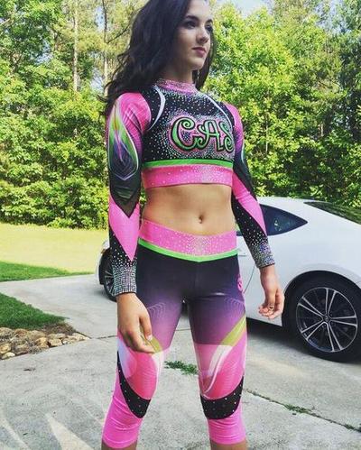
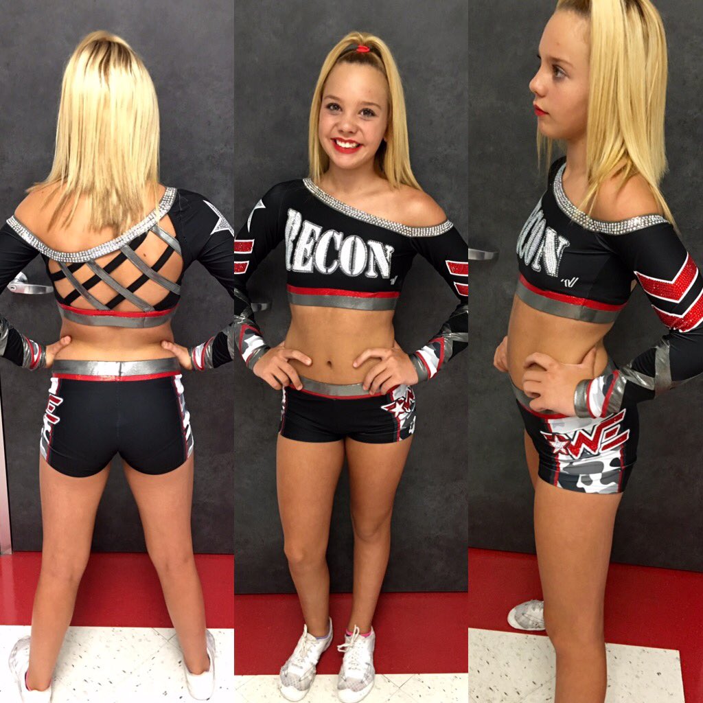
All-Star New Uniforms 2016-2017 Season

Welcome to our Cheerleading Community

Members see FEWER ads... join today!

So many space needles.

I thought the space needle on the back of their old uniforms was a nice, subtle touch--reppin' their general geography and all. I'm guessing they got a lot of compliments on its inclusion last season. I think they ran with the positive feedback and may have overdone it a tad.
 
my old gym's new program uniforms
Screen_Shot_2016_07_18_at_8_06_14_PM.png
[/url]imageupload[/IMG]
30xgye1.png
[/IMG]
30xgye1.png

1z1v3tz.jpg

I love the space needle on the back (though now hearing they aren't actually from Seattle makes it a little confusing) but I could've done without the ones on the arms. That being said, the space needles on the arms don't bother me anywhere near as much as the butt rhinestones (why are these even a thing Rebel?)

Everything else is nice!
 
I feel like uniforms are starting to look like glorified Power Rangers or something from Marvel comics. Some of these just need a mask to complete the look.

Power Rangers uniforms? Why would you ever think that?

rS16QHs.jpg


ETA: the sublimation is a nice touch, especially when you have so much extra fabric with the capris, but I think the top is a little too busy.
 
I thought the space needle on the back of their old uniforms was a nice, subtle touch--reppin' their general geography and all. I'm guessing they got a lot of compliments on its inclusion last season. I think they ran with the positive feedback and may have overdone it a tad.
Absolutely love the space needle on the back.
 
I feel like uniforms are starting to look like glorified Power Rangers or something from Marvel comics. Some of these just need a mask to complete the look.

I would have loved to look like a superhero cheerleader as a kid. Actually, as an adult, I would still love that. I do think that all star uniforms are getting a bit costume-y, but I have no problem with that as long as the uniforms stay functional, i.e. we don't start put capes on uniforms (insert Incredibles reference here). I'm all for clean lines and no superfluous cutouts, but I love a well designed artistic uniform too.
 
NoCapes_zps82c1bcc0.jpg
I would have loved to look like a superhero cheerleader as a kid. Actually, as an adult, I would still love that. I do think that all star uniforms are getting a bit costume-y, but I have no problem with that as long as the uniforms stay functional, i.e. we don't start put capes on uniforms (insert Incredibles reference here). I'm all for clean lines and no superfluous cutouts, but I love a well designed artistic uniform too.
 
I just dont get the skort thing. Either pick shorts or skirt. The skirts are so short why even have them. I miss the comfy, practical not a contest uniforms.


UCC Panthers • IOC5 • new team unis


Im not a fan of stomach mesh but I've kind of accepted it's part of cheer now. That said, I really like these and I think they did an excellent job with the boys uniform. Both in matching it, and in making pink a color that works for a boys uniform.
 
They are great if you like the look of the skirt without the ride up.

Except for the fact that they ride in the back on anyone with any kind of thighs and end up looking more like bloomers than shorts. The shorts part is way too short in most cases.


Sent from my iPad using Tapatalk
 
I just dont get the skort thing. Either pick shorts or skirt. The skirts are so short why even have them. I miss the comfy, practical not a contest uniforms.
CP loves her skort. She likes the look of a skirt, but doesn't have to worry about pulling it down after tumbling.
 
The back is a disaster waiting to happen much less trying to find a bra that offers any support at all will be next to impossible...also the silver details at the bottom of the sleeves look like duct tape.
The overall uniform is pretty and is unique in a sea of chest cutouts and arm mesh though

Sent from my SM-G930R4 using Tapatalk
 
Back