- Apr 8, 2011
- 5,388
- 17,831
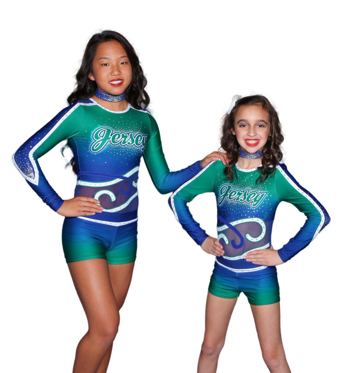
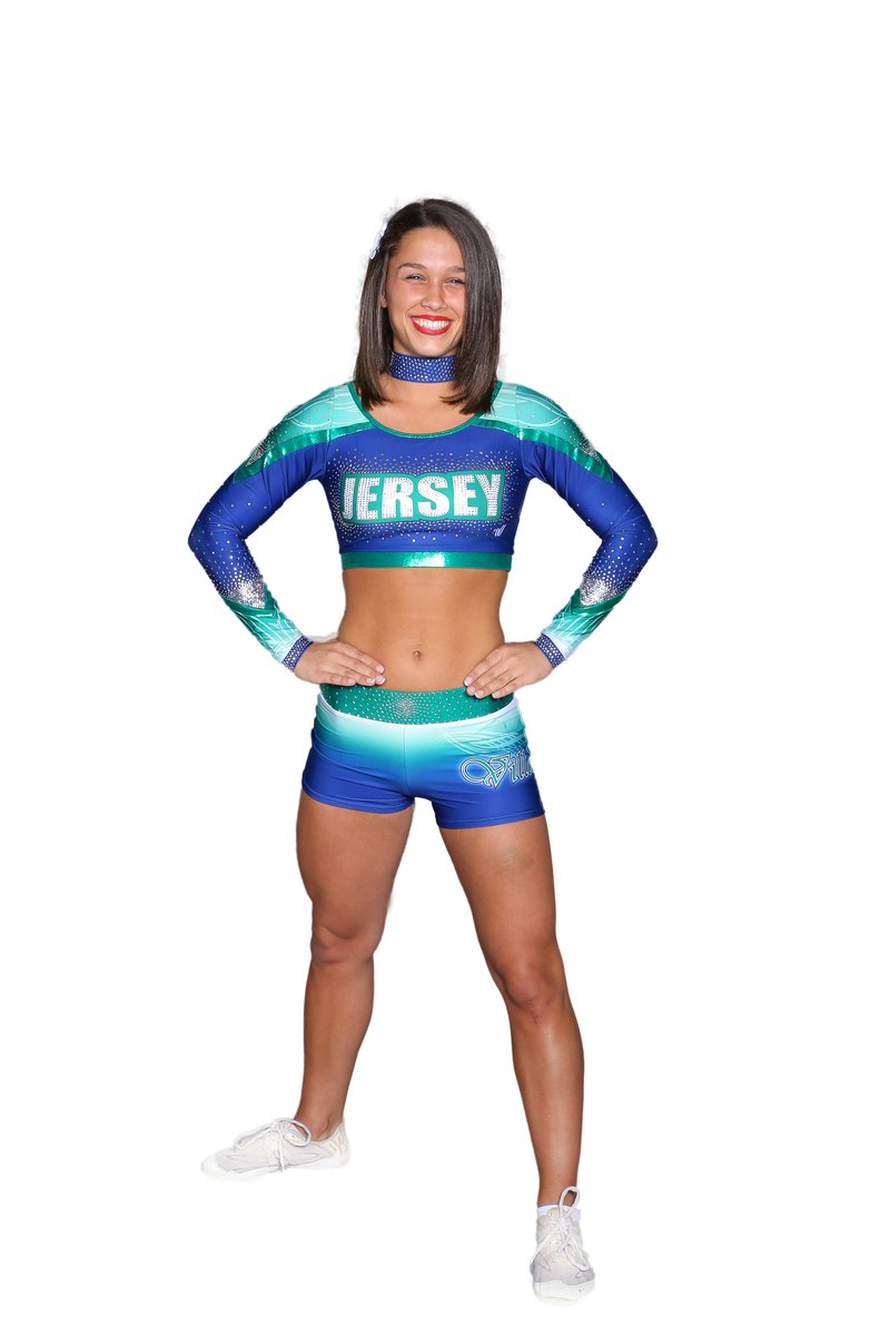
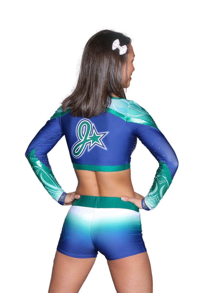
Jersey All Stars NEW uniforms 2015-2016 season
VIDEO REVEAL!
Gym Uniform
Worlds Uniform
I'd like to get rid of all of the chokers and change the worlds' team "Jersey" font to the gym's signature cursive font. don't change your branding now.
") , our kids and parents LOVE the uniforms.
, our kids and parents LOVE the uniforms.")