LeahofthePack
I recognize any state in a crowd
- May 27, 2011
- 1,185
- 2,613
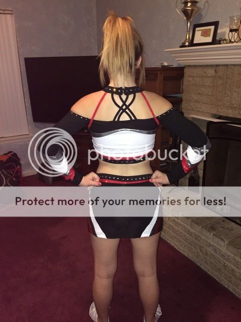
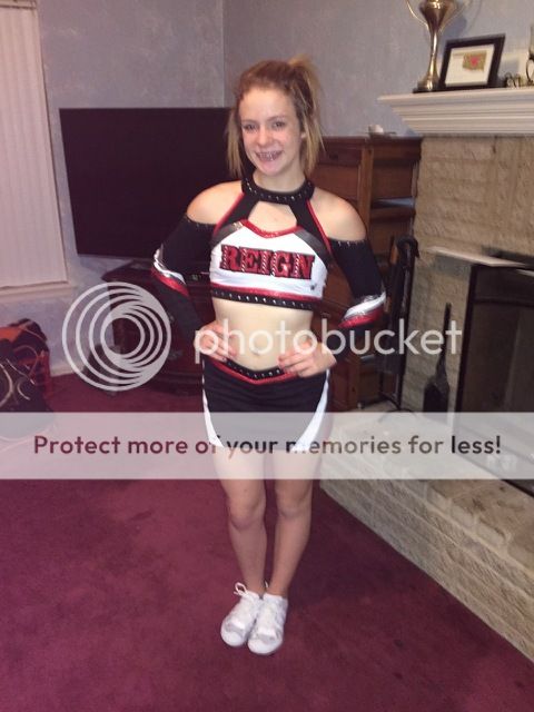
No. The belt and the big red shoulder line do not balance well. Personally do not like the back. The gradient on the arm isn't too bad though.
Since it was already posted on Cheer Media, here is the PROTOTYPE for Carolina Crossfire from last month.
Changes will be made and the actual uniform should be here this month
Sent from my iPhone using Tapatalk